PULL.HOCKEY
Designed a logo for a hockey-related app called "Pull.Hockey". Designed with hand-sketching and Adobe Illustrator.

So this isn't the logo that the client ultimately picked, but this was my favorite. I like the angles, the swooping shapes, and how the "H" is integrated as the stem of the "P"

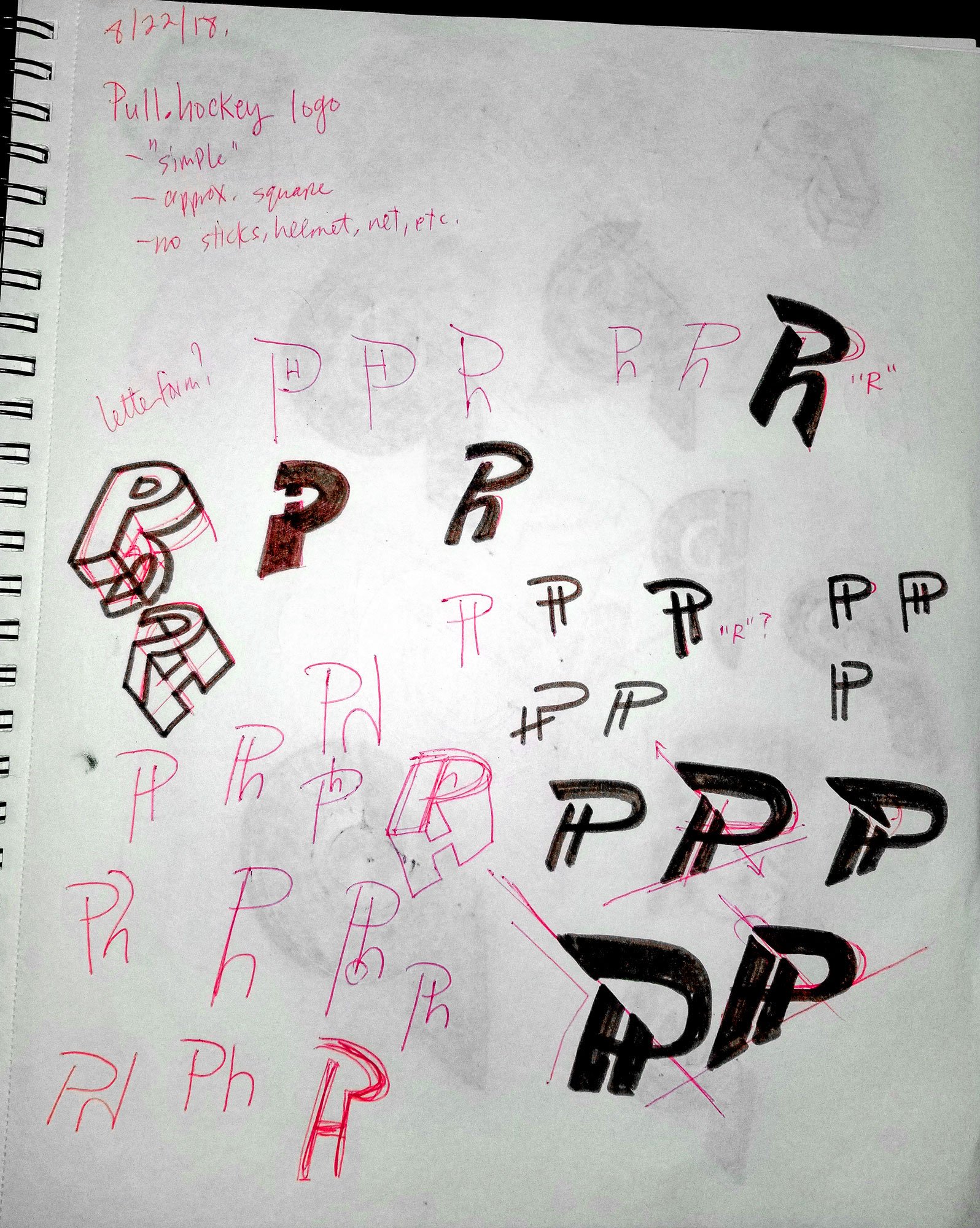
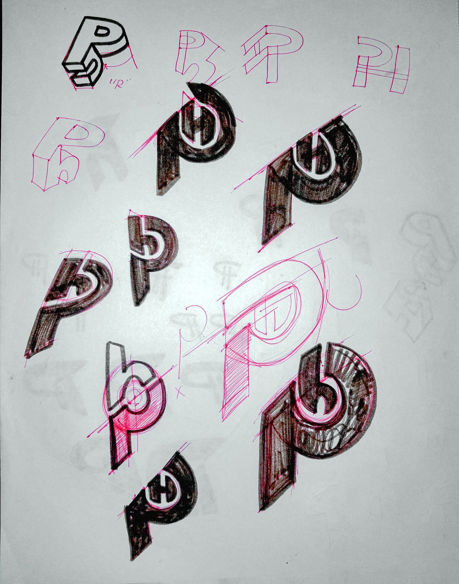
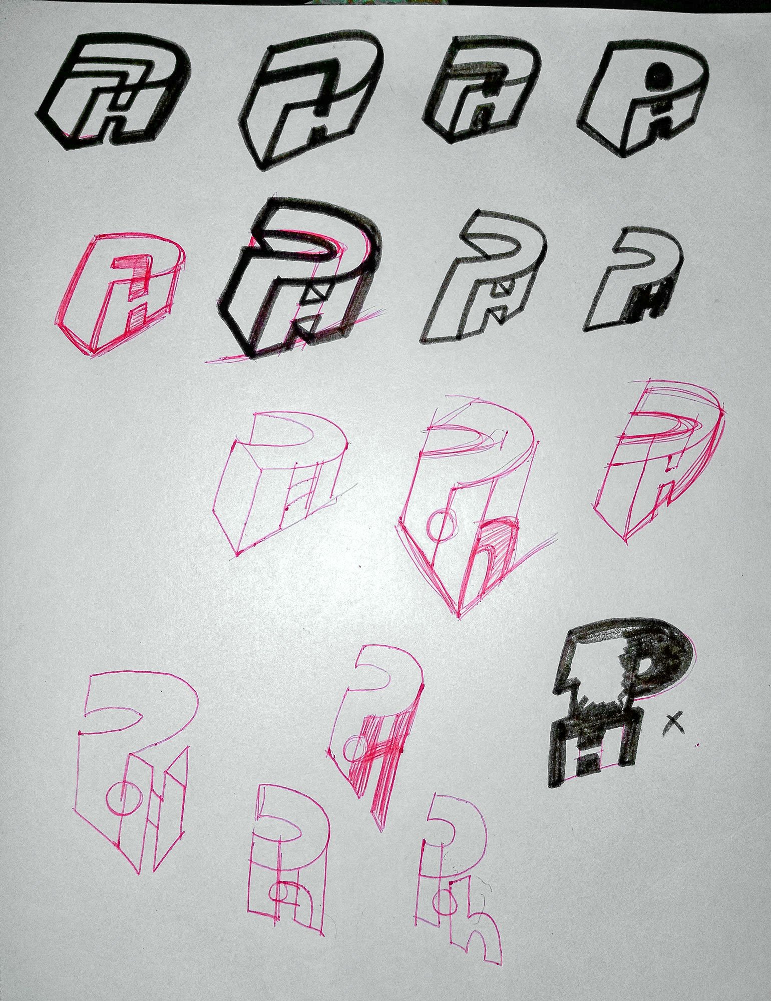
Logo options presented to client. I went for a totally typographic approach, trying to combine "P" and "H" in an interesting, dynamic, sporty way.

Concept sketches

Concept sketches

Concept sketches

The client wanted the letters to be separated a bit more. He also wanted to include the period between the letters. Fair enough -- here was my first stab at this

Here was the refinement -- I pulled the right-hand edge of the "H" leftward a bit, made the whole thing a bit less wide. This was the logo that the client ultimately chose.
