TAMPA BAY LIGHTNING
LOGO DESIGN / UNIFORM DESIGN / INDEPENDENT WORK (2018)
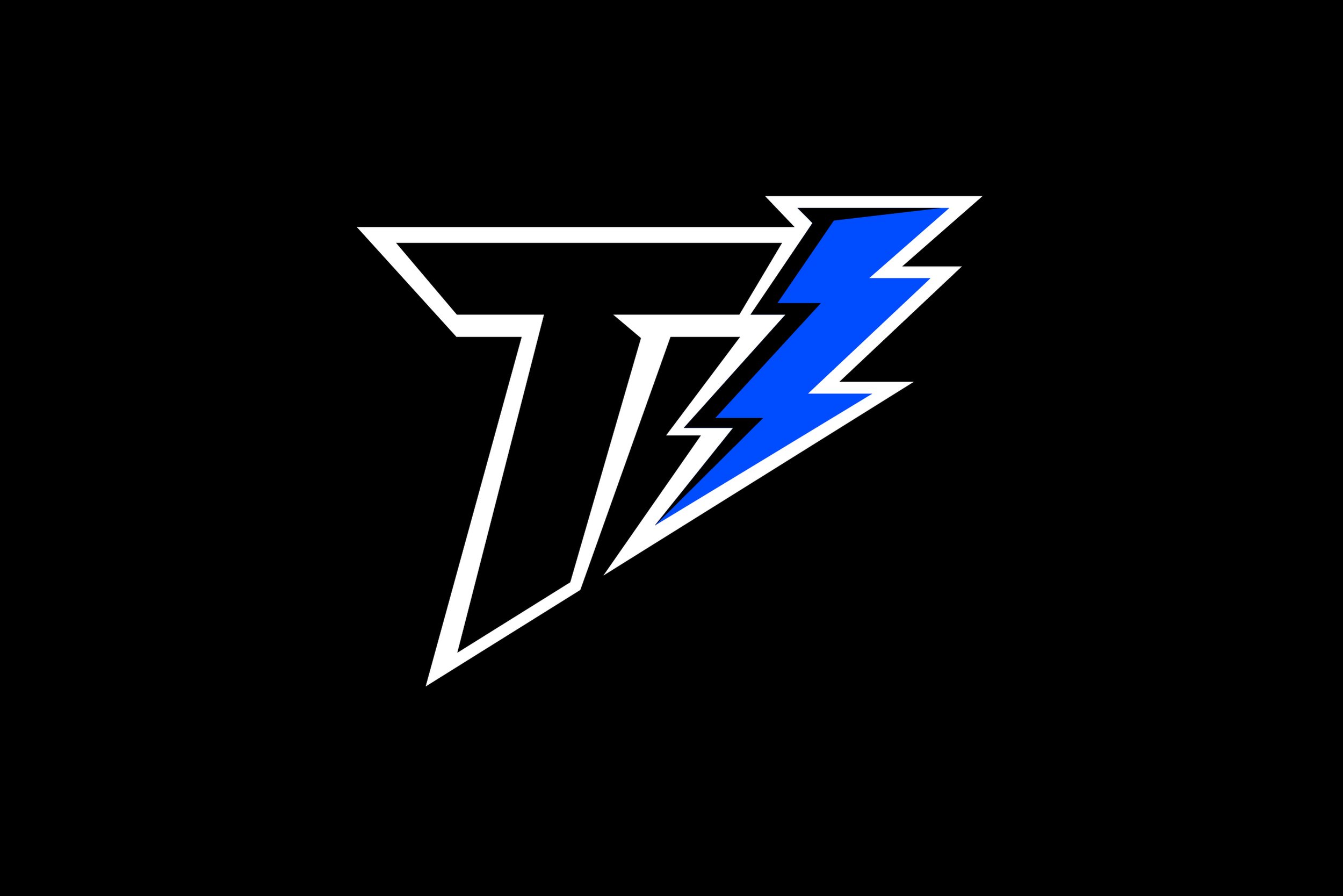
Rebrand of the Tampa Bay Lightning (NHL). I found a compact way to visually merge the “T” (Tampa), the lightning bolt, and “B”, which here exists as an actual bay in the negative space of between the “T” and the lightning bolt.

The basic, light version of the logo

The dark version of the logo
Breakdown of the different conceptual elements of the logo

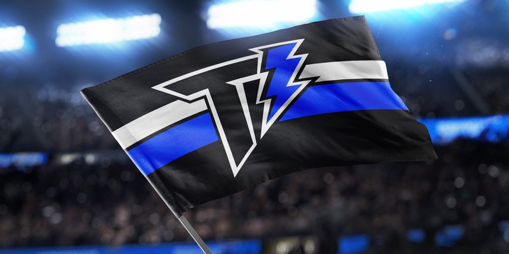
The light version on a non-white background, with a white keyline

OPTION: stripped-down, one-color, blue on black

OPTION: stripped-down, one-color, blue on white (with filled bolt)

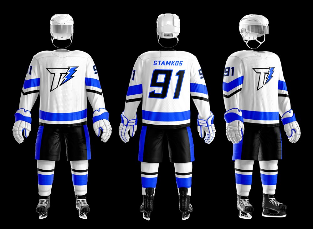
JERSEY & UNIFORM
Here are some uniform concepts. I tried to incorporate the angular feel of the logo without going too far into tacky, zig-zaggy lightning bolts. I prioritized blue over white and made the blue stripes large since blue and black can sometimes blend together a bit. Overall when I do jersey concepts I try to keep them clean, bold, and classic.


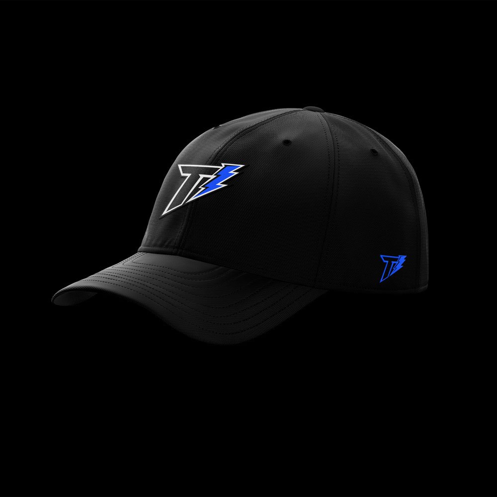
CLOTHING MOCKUPS